
EXPERIENCE:
BRAND IDENTITY; PACKAGING DESIGN
Our Cup Of (Tea?) is a fictional menstrual cup brand designed to make period care feel more open, playful and human.
The identity invites people into a friendly conversation about their periods through a visual world that feels direct, warm and slightly imperfect. Even the name suggests a shared, everyday ritual - something that is ours, made for us, and worth talking about openly.


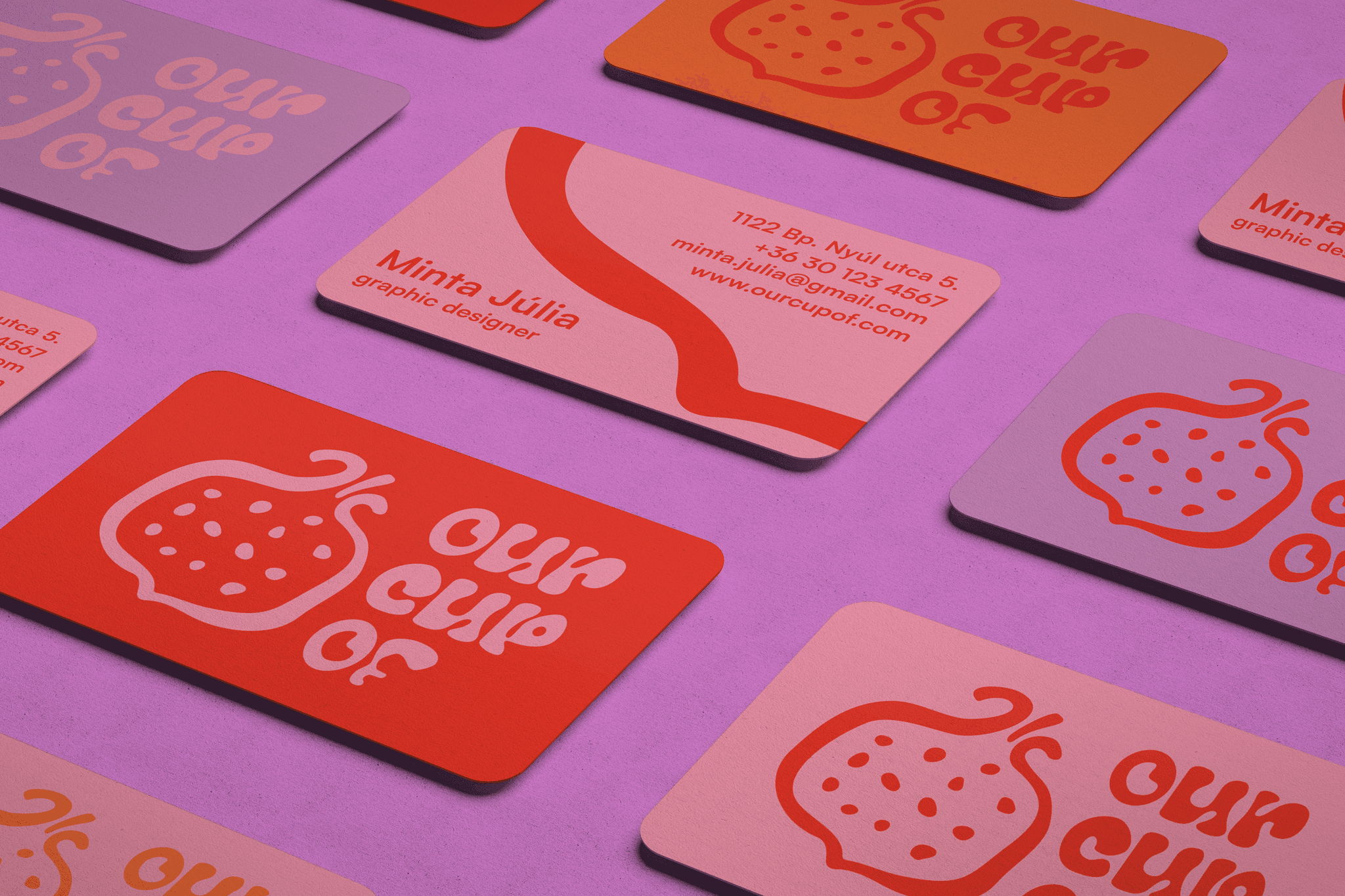
result
The logo was developed from a hand-painted pomegranate emblem, chosen for its organic form, rich texture and cultural associations with cycles and renewal. By vectorising the painted mark, I kept a sense of human imperfection while making it work as a flexible brand element across packaging and print materials.
The packaging system translates the three cup sizes into clear visual differences. The changing cut-away edge, together with the density and scale of the pattern, helps indicate each product’s capacity while keeping the range visually coherent.
The colour palette reflects the warmth, diversity and playfulness of period care, moving away from the overly clinical tone often associated with the category.
Created at Corvin Rajziskola
Consultants: Eszter Szőcs, Judit Tóth